Charts serve as fundamental tools for traders who navigate through financial markets. Candlestick charts remain at the top of popular charting methods because they provide traders with visually detailed information about market trends and market sentiment. This guide details the essential elements of candlestick charts and supports beginner and intermediate traders in developing their skills to master how to interpret candlestick charts.
What is a Candlestick Chart?
A candlestick chart shows how an asset’s prices move throughout a selected timeframe. Each candlestick provides four key data points: Each candlestick contains four essential price indicators for its period which are commonly abbreviated as OHLC.
A single candlestick has two main parts. The broad section of a candlestick chart represents the range between the opening and closing prices of an asset. The small lines above and below the body of a candlestick chart are known as “wicks” or “shadows.” The top wick displays the highest trading price point while the bottom wick shows the lowest price reached. The color of the body is crucial: When a candlestick chart shows green or white colors it indicates the stock ended higher than it started which represents a bullish trend and red or black colors signify that the stock closed lower than its opening which indicates a bearish trend.
The Beginnings of Candlesticks
In 18th-century Japan rice merchant Munehisa Homma created candlestick charting to monitor rice prices and understand market psychology. Steve Nison introduced these techniques to Western audiences in the early 1990s where they achieved global popularity.
How Candlesticks Work
A candlestick provides a visual summary of the trading conflict between buyers (bulls) and sellers (bears) during specific timeframes that span from minutes to months. When the market closes higher than it opened the green (or white) bullish candle emerges. The formation of a red or black bearish candle happens when the closing price falls below the opening price.
The body length of a candlestick serves as a measure of how strong the price movement was. When a candlestick features a long body it represents strong buying force for green candles and strong selling force for red candles. When the candlestick body is short it demonstrates lower momentum or a lack of market conviction.
Wicks reveal information about market volatility and points where prices face rejection. When prices displayed significant movements beyond the opening and closing levels before stabilizing they indicated strong volatility and testing of different price levels. The short wicks on a candlestick show that trading activity was concentrated around the opening and closing prices which demonstrates reduced volatility. The presence of a long upper wick suggests that buyers initially pushed prices higher before sellers pulled them back down before the trading period ended.
Practical Uses in the Trading Arena
Multiple fundamental purposes exist for traders who utilize candlestick charts in their analysis. Candlestick charts enable traders to quickly determine market sentiment as either bullish, bearish or neutral. Pattern recognition depends crucially on candlesticks because particular candle sequences reveal potential future price trends including reversals and continuations. Some candlestick patterns reveal market indecision which serves as critical trading signals. Many trading strategies incorporate this analysis as one of their fundamental components.
The Upsides: Why Traders Prefer Candlesticks
Market participants prefer candlestick charts because they convey comprehensive OHLC data together with instant visual sentiment analysis. The visual presentation of candlestick charts facilitates quick identification of price patterns and understanding of price action. The majority of traders use candlestick shapes to detect market participants’ collective psychology and obtain insights that surpass numerical data alone. The broad applicability of candlestick charts across stock, forex, and cryptocurrency markets boosts their attractiveness to traders.
The Downsides: Limitations and Risks to Consider
Candlestick charts provide useful insights but they remain imperfect. Relying solely on patterns can lead to errors because they can generate misleading signals. Validating signals requires additional support from other technical indicators such as volume or moving averages and consideration of the market environment. The analysis of patterns becomes subjective when those patterns lack clear definition. Patterns on very short timeframes tend to be more erratic (“noisier”) compared to longer timeframes such as daily or weekly charts.
Common Candlestick Patterns: A Brief Introduction
Candlestick patterns fall into three main categories which include bullish patterns, bearish patterns, and indecision patterns. Learning some fundamental patterns serves as an excellent foundation for beginners.
Bullish Reversal Patterns
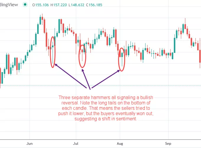
When these patterns emerge following a downtrend they indicate a potential rise in price. A Hammer appears as a single candlestick with a small body positioned near the top of the trading range along with a lower wick that extends at least twice the height of the body. The pattern shows sellers forced prices lower at first but buying pressure strengthened which led to closing prices at or above the opening level.
Bearish Reversal Patterns
After an uptrend these patterns emerge to indicate a likely price decline. The Shooting Star candlestick pattern serves as the bearish reversal equivalent to the Hammer pattern. The candlestick features a minimal body at the trading range’s lowest part while displaying an extended upper shadow. Buyers tried to elevate prices yet sellers regained dominance and drove the price to close near its opening point or lower.
Indecision Patterns
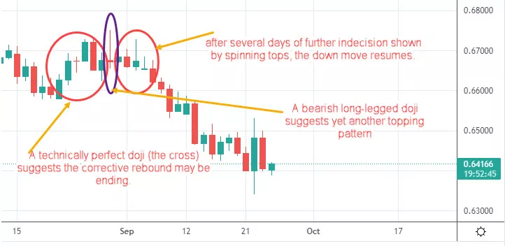
The patterns demonstrate equal forces from buyers and sellers which point to market ambiguity. The Doji candlestick pattern shows very similar opening and closing prices which creates a minimal or absent candle body. A Doji displays a visual shape that looks like a cross or plus sign. The Doji pattern displays market indecision as neither buyers nor sellers achieved dominance during that period. Doji types such as Long-Legged Doji or Dragonfly Doji emerge from variations in wick lengths yet all reflect market uncertainty through minor differences.

Gaining proficiency in these basic patterns will serve as a solid foundation before exploring complex patterns like Bullish/Bearish Engulfing or Morning/Evening Stars.
Avoiding Common Pitfalls
New traders frequently struggle with the same challenges when they begin learning how to interpret candlestick charts. Many traders err by analyzing chart patterns separately without taking into account the market trend as well as the surrounding support and resistance areas alongside trading volume. A bullish pattern within a strong downtrend does not offer reliable trading signals compared to a pattern that surfaces at a key support level.
Do not seek to identify patterns in areas where they are not clearly visible. Patterns that lack clarity often indicate weak trading signals. Before basing trading decisions on a candlestick pattern traders must ensure it has completed its formation since partially formed candles can eventually alter their appearance. Develop your trading skills by studying the market psychology that leads to different patterns instead of memorizing their names. This shape describes the ongoing battle between the buying and selling forces in the market. When you chase large market moves you risk entering after a massive candle has already appeared which indicates you’ve missed the main opportunity.
Tips for Getting Started
To effectively use candlestick charts, start by mastering the basics: Learn the formation process of individual candles and interpret their component meanings. Concentrate your efforts on understanding a select number of dependable patterns instead of attempting to grasp numerous patterns simultaneously.
Candlestick patterns require analysis alongside other technical analysis tools for effective trading decisions. A trader should combine candlestick patterns with technical elements including support and resistance levels together with trendlines and volume analysis and indicators like Moving Averages and Relative Strength Index (RSI). Enhance pattern recognition expertise through demo account practice or historical chart analysis which allows experience building without financial risk. The timeframe matters when analyzing patterns because daily and weekly charts tend to hold more significance than very short intraday charts.
Key Takeaways
Candlestick charts deliver powerful analysis capabilities through price action and market sentiment visualization. Traders can improve their decision-making abilities by studying individual candle formations and identifying essential market patterns. The optimal use of candlesticks occurs when they are integrated into a complete trading strategy that combines multiple analytic techniques with proper risk control measures. Learning about how to interpret candlestick charts effectively requires ongoing study and practice to integrate this analysis into overall trading strategies.